 |
|
|
|
|
|
|
|
|
|
|||||||
 |
|
|
Thread Tools | Search this Thread | Rate Thread | Display Modes |
 2016-05-09, 10:12 AM
|
#1 |
|
If something goes wrong at the plant, blame the guy who can't speak English

Join Date: Mar 2014
Location: Lisbon, Portugal
Posts: 38
|
Choosing a good banner is not an easy task. Its not just about selecting your favorite color or matching some words. Its a hard process but its super important. Indeed, if a banner is successful and able to attract high volumes of quality traffic, youre on the path to achieve a great performance. I can say that the most important decision youll have to make as a media buyer is the choice of ads that are to be placed on each campaign.
In fact, if youre savvy, you can save money because you dont need to pay too much to beat your competition and you gain more attention from your target. In other words: you can have the best offer, the highest bid and the most performing target. However, if you dont have an appealing banner, visitors will never click on it. In this article, Ill give you some key tips thatll come in handy when you optimize your creatives. As far as communication is concerned, there are simple adjustments that can solve many of your problems. 1. Whos your target? In order to understand what a good banner is, you need to understand your audience. Visitors from different countries, cultures and ages will react differently to a banner image. The same ad, in different countries, wont have the same performance. The first thing you should do is set your target. Who are they? Are they men? Women? Teenagers? Which language do they speak? If youre able to answer these questions you can adjust the copy of the banner, colors, design, and so forth. Example 1: 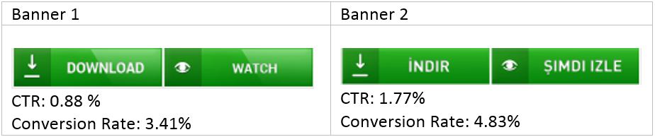 This banner was placed in a campaign targeted to Turkey. Note that the banner that contained words in the most spoken language of that particular country (banner 2) had better results than the one containing words written in English. 2. Which is the spot you want to promote? If you put the same banner in different spots you wont achieve the same performances. A banner that works very well on the spot 300×250 (for example) may not be as well-performing on the spot 728×90. The same thing is true when were talking about the zone (mobile top, mobile bottom or NTV). Example 2: 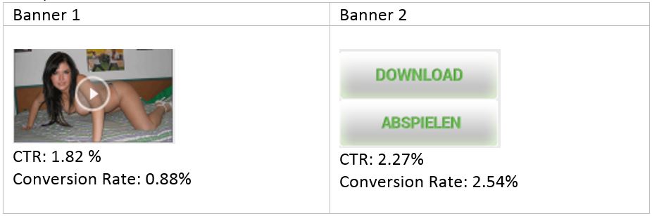 These banners were tested on the Instant Message spot. This spot is like a chat window that appears at the bottom of the page and it can be perceived as a notification to the user. For this specific spot, the banner with texts that induce an action (saying for example download or watch now) worked much better than the one with an image. Imagine you are navigating a website with a lot of interesting videos and you want to click on them to watch. If an image appears at the bottom of the page, youll understand it as a suggestion of more related videos. On the other hand, if a text appears, youll perceive it as alert message, becoming immediately prone to click on it. 3. Which is the website or group of websites where you want to display your ad? For some adnetworks, you get the info regarding the websites where your banner is shown or, in other words, from the publishers. If youre buying your traffic on those platforms, you can surely improve your results. When youre creating an ad, the different layouts of websites will require different approaches. The banners should be incorporated into the website; that is, they should look like theyre part of it. Indeed, it should always look natural; as if it belongs on the page. Thats why you should avoid putting big arrows or crazy animations in a poor attempt to get the users attention. All you have to do is navigate on your top websites, identify your top spots, and then create an image that needs to blend in and never look like a blatant advert. You should also adapt the color, font size, and ad shape to the look & feel of the website or group of websites. Example 3:  Banner 2 was created after a thorough analysis of the website in which the campaign was targeted. In fact, its very similar to the videos shown on that website. If youre able to do the same in your campaign, you can definitively have better results. There are a lot of other tips you can find in a large number of studies regarding this issue. Nonetheless, these are the most relevant and the ones that make you get better results in a short period of time. Try these tips and then share your results with us! Dare to read even more posts? Check the Mobidea Academy!
__________________
Mobidea - Monetize 3G & Wi-fi |

|

|
|
|
|


 Linear Mode

